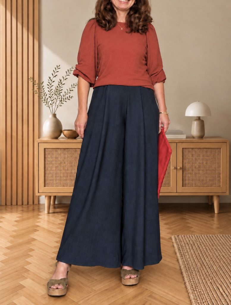
if your wardrobe runs mostly on neutrals, adding colour feels like a gamble. which red? with what? and how much of it before it stops looking like you? i don’t guess anymore. for this coral red outfit, i borrowed the answer from a book.
this is the first colour study in a small series. each one starts with a single page of a dictionary of color combinations and ends with an outfit i actually wear. this time: coral red.
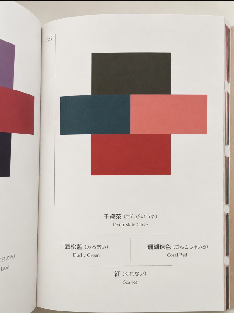
the page: four colours on p. 332
the combination sits on page 332. four colours, each with its japanese name:
- deep slate olive · 千歳茶 (sensai-cha)
- dusky green · 海松藍 (miru-ai)
- coral red · 珊瑚珠色 (sangoshu-iro)
- scarlet · 紅 (kurenai)
two reds, one cool green, one near-black. on paper it looks bold. worn, it’s calmer than you’d expect.
how the palette becomes a coral red outfit
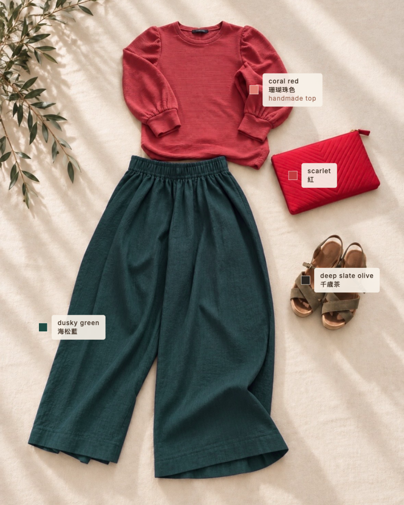
each colour gets one job:
- coral red — the top. handmade: the jo pullover by fibre mood, in a fabric from rolypoly in munich. it’s the colour closest to the face, so it sets the tone.
- dusky green — the wide trousers. the largest area goes to the calmest colour.
- scarlet — the clutch. the loudest red, in the smallest piece.
- deep slate olive — the sandals. it does the job black usually does, only softer.
what goes with coral red
three things make this palette work, and they carry over to any colour you start with:
- pair it with a close relative. coral and scarlet sit right next to each other. together they read as one deliberate red, not two colours competing.
- give it a cool counterpart. dusky green sits on the other side of the colour wheel. it calms the reds and keeps the outfit from turning warm all over.
- swap black for a dark neutral from the palette. deep slate olive grounds the look without the hard edge of black.
a note for petite frames
on a small frame, where a colour sits matters as much as which colour it is. the wide trousers make one long, unbroken column of dusky green from waist to floor. the coral top draws the eye up to the face. the scarlet stays small, so nothing cuts the line in half.
try your own colour study
- pick one colour you’d like to wear more of.
- look it up in the index at the back of the book. it lists every combination a colour appears in.
- choose a combination and give each colour a piece: the calmest colour gets the biggest area, the loudest the smallest.
- start with what you already own. often only one piece is missing, and that’s the one worth sewing. if you’re planning a small wardrobe around a palette, sewing your perfect capsule wardrobe is a good companion.
would you wear this combination? or which colour would you start with? tell me on instagram, @far_and_close.
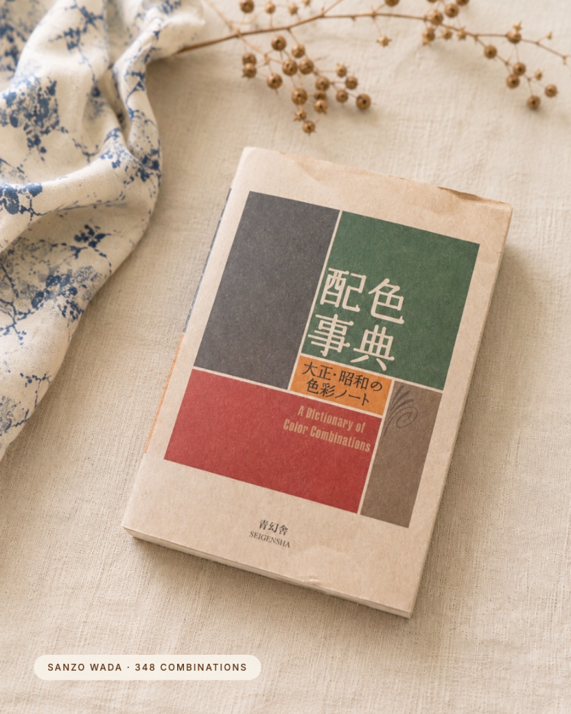
the book · a dictionary of color combinations (配色事典), sanzo wada, seigensha — read my review → · find it on amazon · ad
this post contains amazon affiliate links (ad). as an amazon associate i earn from qualifying purchases — at no extra cost to you. all opinions are my own.