some of the most useful books on my sewing shelf aren’t sewing books at all. a dictionary of color combinations – this small japanese paperback is one of them — and it has quietly changed the way i put a handmade wardrobe together.
This post contains affiliate links (ads). As an Amazon Associate I earn from qualifying purchases — at no extra cost to you. All opinions are my own
what a dictionary of color combinations actually is
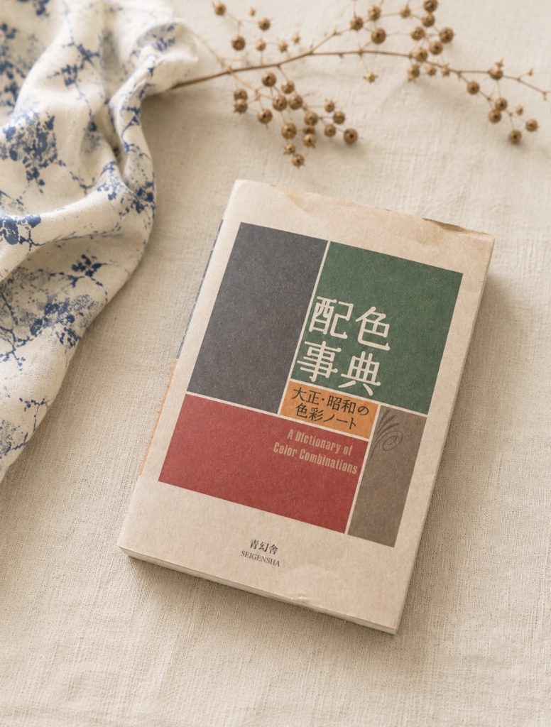
a dictionary of color combinations‚ (配色事典) looks unassuming, but it holds a whole way of seeing colour. the palettes come from the work of sanzo wada — a japanese artist, teacher and costume designer who worked through the taishō and shōwa eras. between 1933 and 1934 he published a six-volume set of colour studies, the haishoku sōkan, the first collection of its kind in japan. decades later, in 2010, seigensha gathered 348 of those combinations into the single volume you can buy today.
each entry is built the same quiet way. a japanese colour name, its reading in kana, an english name, and a set of cmyk values — nothing more. no trend language, no seasons, no rules about what belongs with what. just two, three or four colours sitting beside each other, printed on soft matte paper that makes even the brightest of them feel calm. towards the back, single colours are also shown as tonal gradations, and there’s an index that lets you look up one shade and find every combination it appears in.
i look for colour relationships first, and fabric second.
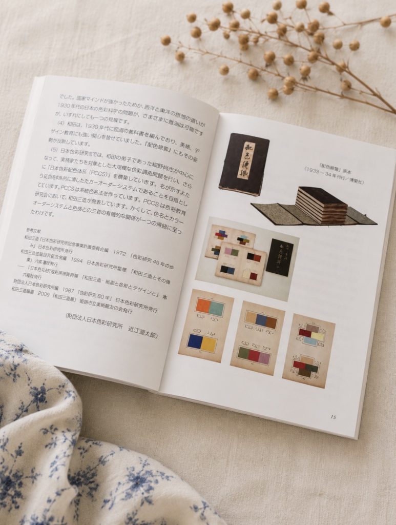
sanzo wada · the essay
the colour researcher behind the book, and his original 1930s volumes.
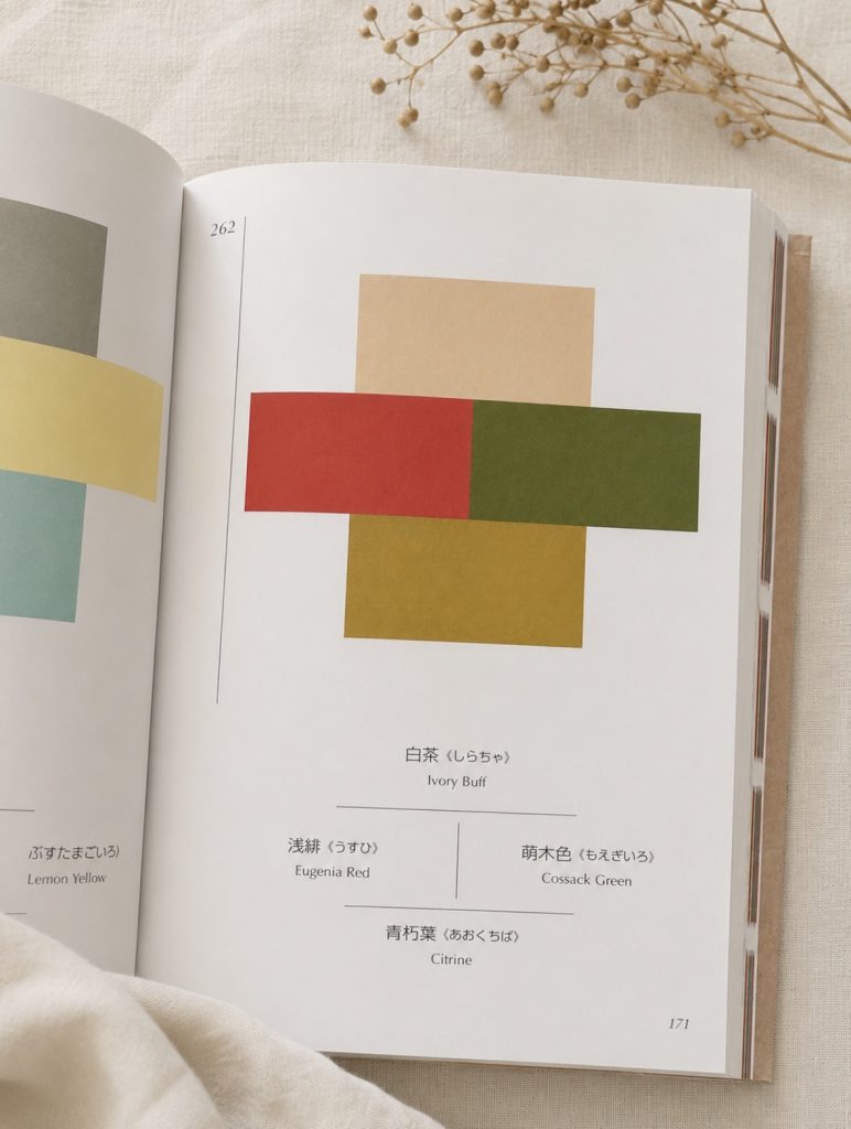
the combinations
colours paired by japanese and english name — two, three or four at a time.
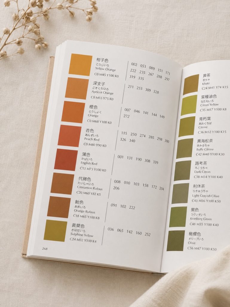
the index
look up one colour and find every combination it appears in.
why it changed how i choose fabric
for a long time i chose fabric the way most people do — one piece at a time. a nice linen here, a cotton i liked there, and then the quiet disappointment of finding they didn’t really talk to each other on the shelf.
this book flipped that around. now i start with a combination and let it lead. seeing colours as relationships instead of individual shades is a small shift, but it’s the thing that makes a me-made wardrobe hang together in a way that’s hard to plan piece by piece.
and the pairings are genuinely surprising. a soft glaucous green (裏葉色) next to a warm orange (no. 007). coral red, taupe brown and a clear lemon yellow together (no. 123) — a combination i’d never have reached for on my own, and one that looks quietly modern. or the crossing blocks of ivory buff, eugenia red, cossack green and citrine on page 171, a palette that could pass for something co
palettes that love natural fibres
what makes the book so easy to sew from is that the colours are already muted. these aren’t screen colours; they’re pigment colours — slightly greyed, slightly warm. that happens to be exactly the register natural fabrics live in. linen, cotton and double gauze all take these tones beautifully, where a pure digital brightness would look plasticky on cloth.
the index earns its place here. if i’ve already got a length of ochre linen waiting, i can find a colour close to it and see everything the book pairs it with — so the fabric i already own becomes the starting point, not a loose end.
subtle, timeless, and made for natural fibres.
it isn’t a book i read cover to cover. it’s one i open — before a fabric order, before cutting into something new, whenever a project needs a second colour and i can’t quite see it yet. for something this small and this quiet, it does a surprising amount of the work. if you sew, it’s worth keeping on the shelf next to your patterns: not for instructions, but for the way it slowly trains your eye to think in combinations.
if you want to go further
if the first volume pulls you in, seigensha later published a second volume — another set of combinations, this time leaning more into how the palettes actually get used, not just catalogued. not essential — the first book does the real work — but a natural next step once you start thinking in palettes.